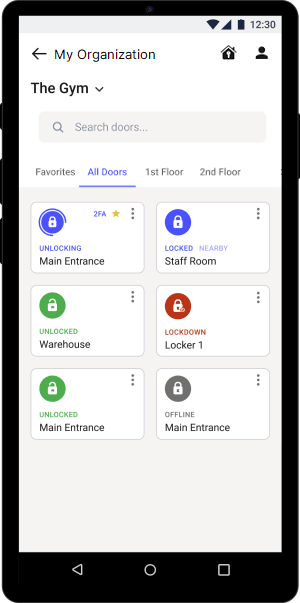
We just revamped navigation within Kisi’s mobile apps to make it easier for you to find the right things. With a cleaner interface – aligned with our new company branding – and more seamless user experience, we’re making it faster and easier than ever for admins to operate their facilities.
Switch between accounts on the organizations screen
One of the most notable changes in the navigation is the newly added My organizations screen. Use the + icon to add further accounts to work with, and quickly switch between them without having to sign out.
Easily access admin and user settings
Now you can directly access both the admin and the user settings via the two icons at the top of the place screen.

We’ve also polished the admin dashboard, by separating organization and place settings.
Find what you’re looking for with the easy-to-spot search bar
We’ve made the search box more prominent and powerful, allowing you to find specific organizations, places, or doors.
A refreshed look-and-feel
The Kisi mobile apps now come with a refreshed visual identity, a new color palette, and a more modern interface design. We believe that the new look and the simplified navigation will make your access control experience cleaner, simpler, and more enjoyable.
The updates are generally available on Android, and will be available in the next 10 days on iOS.
How can we make your admin experience even better?
Send an email to let us know which feature you’d like to see in the mobile apps. We’d be delighted to hear from you.
Related articles


