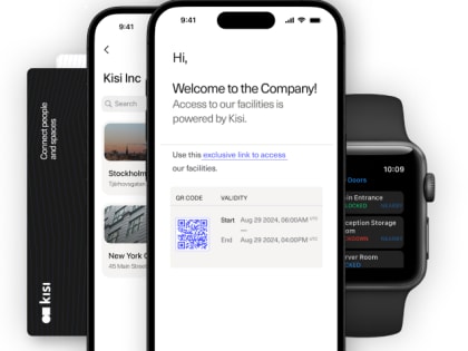
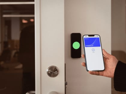
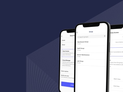
We are proud to announce the launch of the redesigned Kisi apps as part of the evolution of our company brand.
Kisi has grown and evolved over the last 10 years, but very little of our visual identity changed in that time. To reflect who we are today and to symbolize our future, we have refreshed our brand identity, and later applied our new identity to our redesigned website.
As a logical next step, our web and mobile apps got a refresh to give a more mature interface design. While doing this, we have continued to take a user-centered approach and drive improvements to give users an unmatched access experience.
A new palette for a simpler, cleaner Kisi #
The new color palette is centered around accessibility, inclusiveness and intuitive patterns. The lets us form our visual language that combines information, color, design and purpose. We chose a new color palette to provide a better, simpler and cleaner experience.
A new typeface for improved readability #
Typography is the art of relaying information, not by attracting attention to the text, but the message itself. After careful consideration, we chose Inter as the new typeface to provide improved readability and legibility.
More balance #
We’ve also put more emphasis on the top navigation bar, giving all the cards within the app an optical anchorpoint. This adds balance to the overall navigation and layout of the interface.
We believe that the new design will make your Kisi experience cleaner, simpler, and enjoyable, while make it easier to find the information you need.
What’s next #
Following the redesign of the web app, in the coming weeks we’ll be releasing the new looks for both our Android and iOS apps. Stay tuned!
We’d love to know what you think! #
Please share your thoughts with us at feedback@kisi.io so we can make Kisi even better.
Oskar Huberhoff
Designer based in Stockholm, Sweden