In this third of four posts about the design approach at Kisi, we cover what thoughts go into a brand, how we conceptualize the application of that brand, and what it looks like when a brand is applied in a visual space. Click here to learn about the Laika Design system, or click here to learn about what went into the design of the Kisi Reader Pro.
Finding connection;
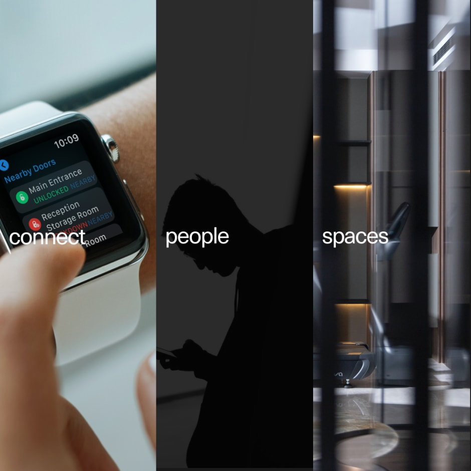
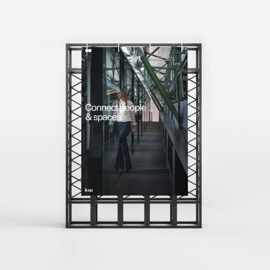
The concept of 'connect people and spaces' fuels the Kisi brand and design. It's the idea that inspires the creation of something new, something better, something incredible. To connect is to explore the space between two separate, and often at odds, elements.
The space between light and dark.
The space between warm and cold.
The space between dynamic and static.
The space between emotional and rational.
The space between organic and mechanical
'Connect people and spaces' is more than a catchy tagline; it's a promise from Kisi to our users. It originates from our identity as a company, as a brand, as employees and as people. All of these perspectives guide our brand voice and design. It originated from a belief that the user experience is the most important thing.
Symbols and visualization;
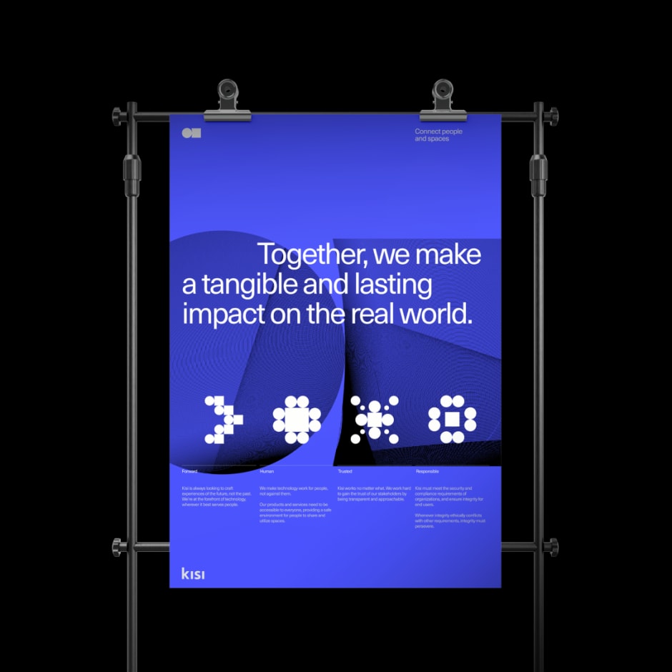
Our new symbol is the visualization of the concept of connection. It links two disparate elements together — people and spaces.
Our symbol represents our vision;
to stay at the forefront of technology, wherever it best serves people.
to be accessible. Our products and services are for everyone.
to be trusted, transparent and approachable.
to be responsible. Kisi ensures integrity for end users.
Name and symbol, connected;
Our logotype is the combination of a wordmark and a symbol. Used separately, we call them wordmark and symbol, together, they are logotype. The wordmark and symbol are the Kisi signature. It's a mark of quality and excellence that our customers recognize and trust.
The wordmark represents the company and the symbol represents the vision; a vision to connect people and spaces.

Philosophies;
Timeless foundation
Maintaining an identity is the mastery of discipline and expression. The same idea is true for our design system, the core foundation being tried and tested, functional, and timeless.
Artistic expression
While systematicism, functionality and timelessness is are important foundations, a brand needs modern tools to express its voice. As an added layer on top of our foundation, we allow our most visual elements to tell contemporary stories.
Intention
Purpose is important to Kisi. It establishes a link between idea, design, concept and communication. By combining timeless typography with artistic expressions and purpose we elevate our communication and visual language for a better emotional response and impact.


Progressive design;
Our core philosophies are what defines and motivates our design and brand. Is it tangible? Is it empathetic? Are we pushing ourselves? Is it progressive? Is it well balanced between rational and abstract?
Using our brand-wide design system and visual language with well-defined ideas and strategies we are able to execute design with high attention to detail.


Oskar Huberhoff
Designer based in Stockholm, Sweden


